Pareto Charts and the 80/20 Rule

A Pareto Chart (or Pareto Diagram) is a specific type of Histogram, or vertical bar chart, ordered by frequency of occurrence. Pareto Chart is one of the Seven Basic Quality Tools. Pareto Chart shows the number of defects generated by type or category of the identified cause, and helps the project team focus on the causes creating the greatest number of defects.
Pareto Chart consists of both a bar and line graphs. The bars represent the frequency of the measure (defect or cause) and the line represents the cumulative percentage value of the measure. The bars are in descending order from left to right.
Pareto Chart is based on Pareto’s Principle.
What is Pareto’s Principle?
Pareto’s Principle or Pareto’s Law states that a relatively small number of causes will typically produce a majority of the problems or defects. It is also known as the “80/20 principle” or the “80/20 rule”.
Pareto Principle is based on a very simple premise that majority of defects or issues are caused by a small number of causes.
It is named after Vilfredo Pareto, an Italian economist who observed that only 20% of the peapods in his garden produced 80% of the peas. In 1896, he published a research paper, which showed that approximately 80% of the land in Italy was owned by 20% of the population.
Joseph M Juran proposed the name Pareto Principle for the “80/20 rule”.
Application of Pareto’s Principle
The primary application of Pareto’s Principle is in Quality management. Pareto charts are used to identify the most frequently occurring causes that lead to majority of the problems.
But it can be applied to almost any field where resources are constrained and effort needs to be focused on the “vital few” causes. You could apply that idea to solve problems in your business, profession, education, or day-to-day life.
There are many examples of this 80/20 rule in real life such as:
- 80% of the wealth in the world is in the hands of 20% of the population
- 80% of the profits of a company comes from 20% of its products
- 80% of the benefits come from 20% of the effort
- 80% of the customer complaints are because of 20% of the defects
- Or even worse, 80% of the customer complaints come from 20% of the customers :)
- 80% of the sales comes from 20% of your customers
- 80% of the software errors are caused by 20% of the bugs
- 80% of the traffic to this blog comes from 20% of the pages
- 80% of the output of a company is generated by 20% of its workforce
- 80% of the conversions happen from 20% of the ads
- 80% of flight delays are causes by 20% of the issues
Steps to create a Pareto Chart
Let’s take the example of a hard drive failures. Assume that a disk drive manufacturer is trying to perform failure analysis of Model X of its disk drive. They want to identify the top issues that cause the Model X drives to fail in order to reduce the failure rate and the resulting warranty returns.
First identify the problem that you want to solve. In our case, the problem is disk drive failure of Model X.
List down the common causes that lead to the drive failures. Let’s say those causes are:
- Firmware issues
- Heat
- Mechanical failure
- Electronics failure
- Human error
- All other causes
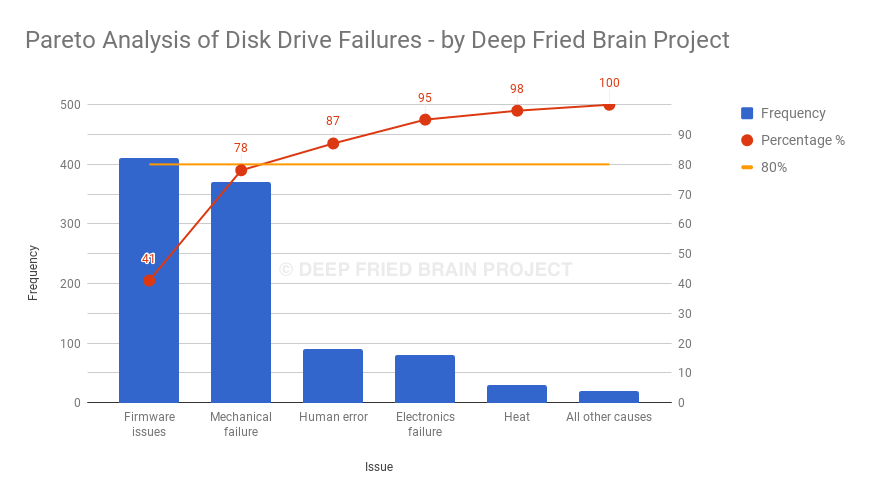
Take a sample of drives and count the frequency of each failure cause. Let’s say we take a sample of 1000 drives and the data looks as shown below.
Causes Frequency Firmware issues 410 Heat 30 Mechanical failure 370 Electronics failure 80 Human error 90 All other causes 20 Note: In this case, the top two causes of failure are obvious and you do not need to draw a chart to figure those out. But imagine a situation where you have 25 or even more causes of failures and their frequency is not so staggeringly different, and you’ll begin to see the benefits of Pareto Charts.
Plot the causes on a bar chart (Pareto Chart) in descending order of frequency from left to right.
Plot a line graph (shown in red) with cumulative percentage of frequency using the vertical right axis.
Draw a horizontal line (shown in orange) on the graph at the 80% cumulative frequency mark. The causes on the left of the intersection point of the 80% cumulative line (orange line) and the cumulative frequency line (red line) are the issues to focus the attention on.
In this case, we need to focus on Firmware and Mechanical failure issues.

Benefits of Pareto Chart
- It helps to quickly identify the most important issues to focus on.
- It helps prioritize the effort when limited amount of resources are available to address a problem.
- It is easy to understand and use.
- It helps to visualize the information by presenting it in a graphical format.
- It is a great communication tool especially in management presentations, and can be used to quickly draw attention to the most important issues.
Limitations of the 80/20 rule
80/20 is just a rule of thumb or a rough guide and not a universal law, which would apply in all situations. Based on the situation, it could be 70/30 or 90/10 or even 95/5.
The rule may not apply in all situations. For example, do not assume that 80% of the questions on your PMP exam would be from 20% of the content :) But it may not be too far off to assume that 80% of the people fail the PMP exam because of 20% of the causes.
Caveats of the 80/20 rule
It is often tempting to manipulate the data to fit the “80/20 rule”. Guard against that temptation.
The two numbers do not have to add up to 100 as they represent 2 different entities (one side is the problem and the other side are the causes). For example, let’s say a software program has 5 bugs, but 1 of those 5 bugs (20%) causes 90% of the crashes. In this case it becomes a 90/20 rule (total adds up to more than 100).
Tips for PMP Exam
Pareto charts are one of the Seven Basic Quality Tools. Checksheets, which are also among the seven basic Quality tools, are often used to collect the data to be plotted on the Pareto Charts.
The Seven Basic Quality Tools are used in all 3 Project Quality Management processes:
- Plan Quality Management
- Perform Quality Assurance
- Control Quality
Note: According to PMBOK® Guide, 5th Edition, all tools and techniques of Plan Quality Management and Control Quality can also be used in Perform Quality Assurance process.
Conclusion
80/20 is just a rule of thumb or rough guideline, but the idea behind it is very powerful. It helps to identify the “vital few” causes that lead to majority of the problems and focus the effort on the top causes. You can apply that idea in almost any sphere of life - business, project management, education, or personal life.
Hope you found this post useful. If you have observed other occurrences of 80/20 rule in your every day life, please share those examples in the comments section below.
2 Comments
Nathan Kerr
Harwinder Singh